
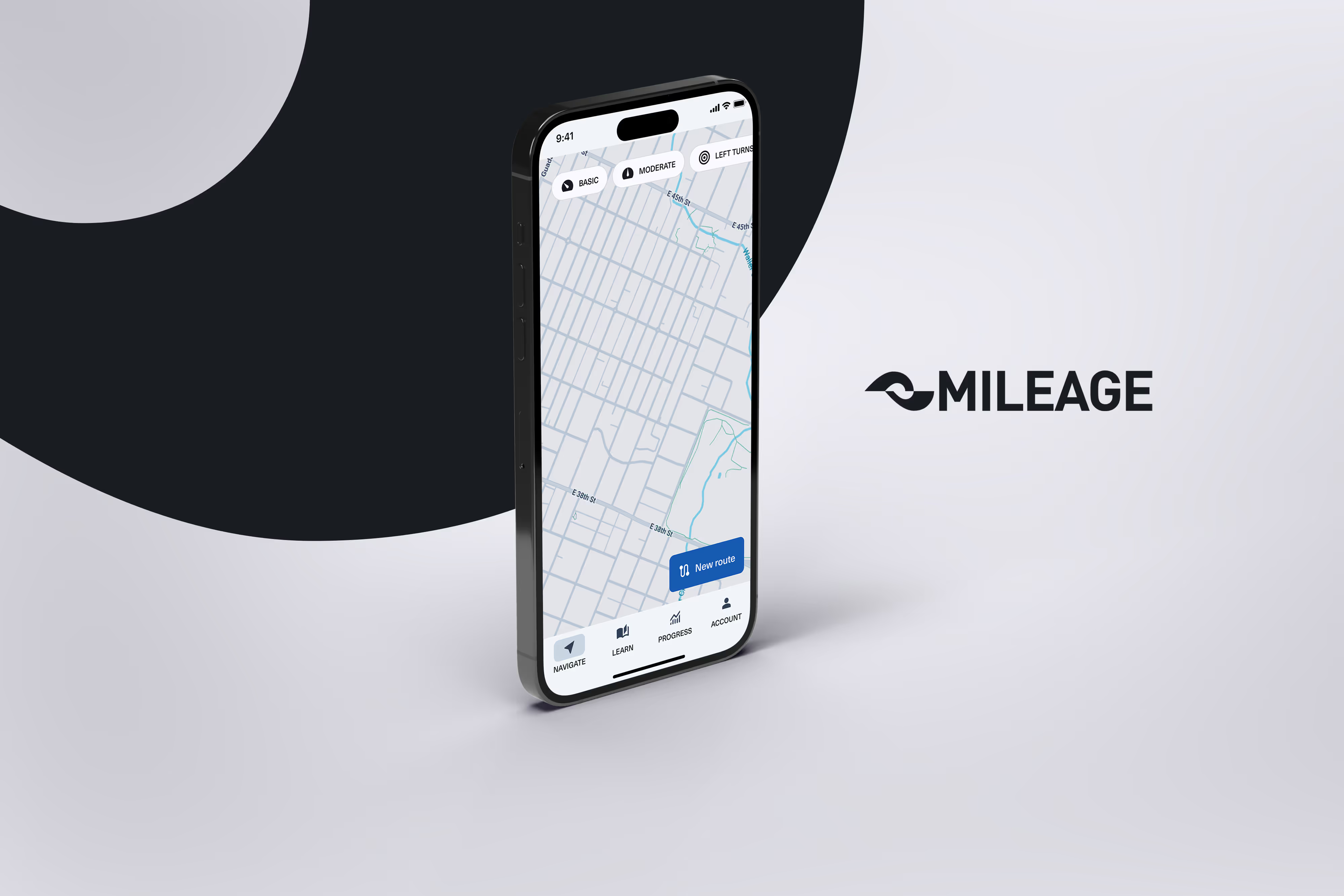
mileage
An education app for people who experience driving anxiety.
end to end design
Conceptual
timeline
100 hours
role
Research,
Product design
category
Mobile app,
EdTech
introduction
For 55% of Americans, common driving maneuvers cause anxiety
About
I bought my first car on November 29, 2022, about 8 years after becoming a licensed driver. I hadn’t touched a car since driving school. I’d never driven by myself before. Legally, I could drive but I was anxious and out of practice. The more I talked to friends about my efforts to pick up driving again, the more I realized I wasn’t alone.
Anxious drivers need help safely gaining experience to build confidence
About 55% of Americans experience driving anxiety while performing common driving maneuvers (source: The Zebra). Drivers looking for guidance on how to grow their comfort zone have limited options.

Source: The Zebra.
Meet your new driving instructor
Mileage combines route planning tools and step-by-step lessons to provide driver education for people who experience anxiety behind the wheel.
research
Familiarity with a location lifts much of the anxiety tied to driving
Continuing education solutions are largely missing from the market
I kicked off research by scouring the market for driver education aimed at licensed drivers. If 55% of Americans experience maneuver-related driving anxiety, surely there’s a few widely available educational products designed to help?


The lack of options implies that learning to drive is perceived as a one-time milestone. Education may not be the solution for every anxious driver, but if you’re looking for practical guidance where are you supposed to turn?
Interviewing anxious drivers
I interviewed 5 participants who self-identified as experiencing some degree of anxiety while driving. I wanted to focus on understanding their background, the situations that contribute to their anxiety and how they currently manage challenges while driving.
My hypothesis was that people need to alleviate anxiety through practice but may not know how or what to practice. I also assumed familiarity with a route through preparation and planning before a drive could reduce anxiety.
Key findings


All roads lead to skill building
Driving maneuvers are a source of stress design can feasibly help with. The ability to handle certain environments is directly related to foundational skills.
Take, for example, driving in the rain. Smooth acceleration and braking are always important, but with the added variable of slick roads it’s especially critical to brake gradually and adjust your following distance around other cars.
If the user’s goal is to grow their comfort zone to include certain environments, then practicing for those situations starts with skill building.
DEFINE
Routes for learning
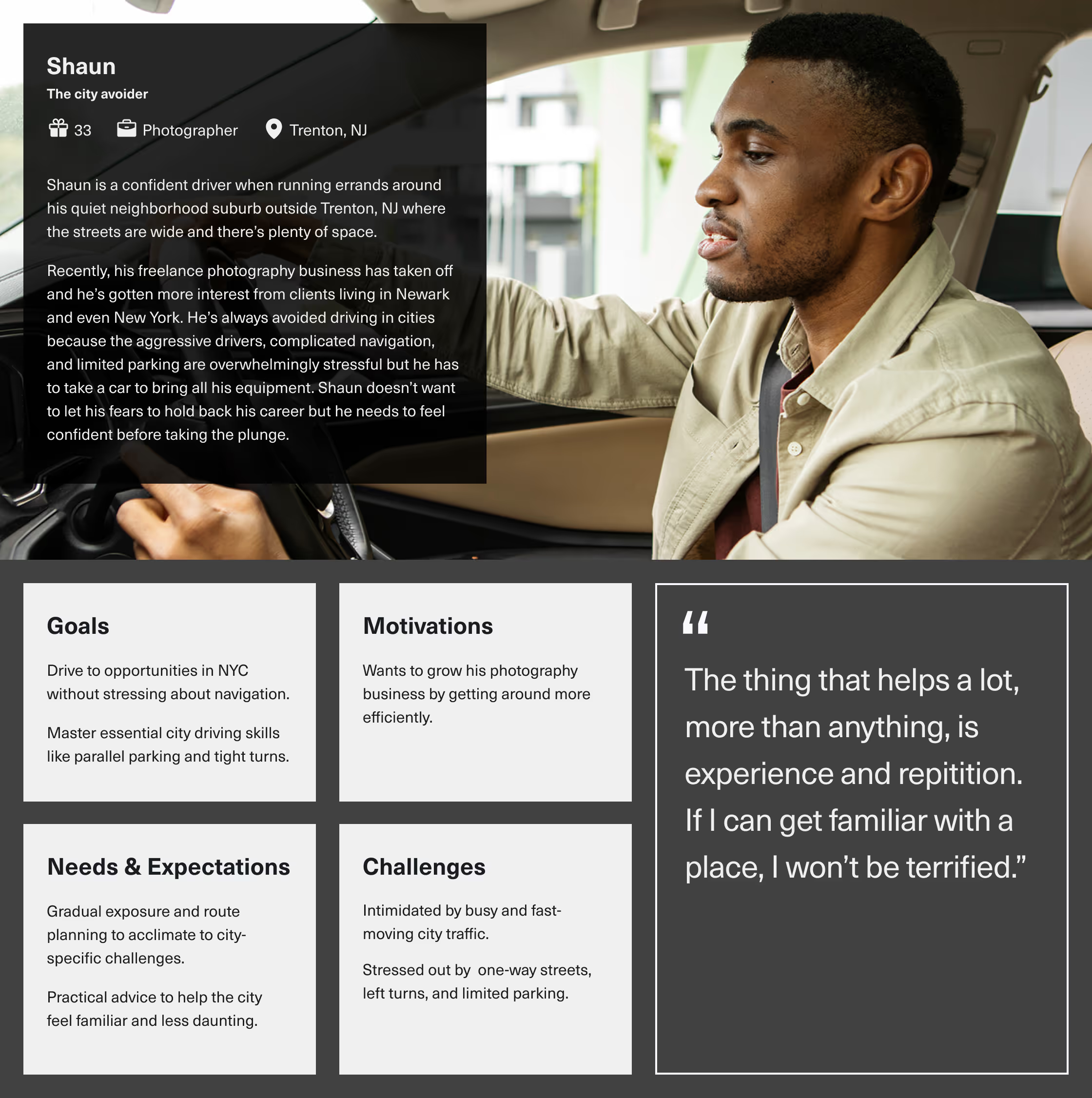
The users
I created two personas to represent the needs of my target audience. Sandra has maneuver-related and general anxiety related needs. Shaun has needs around driving in a challenging environment.
Shaun's needs may conflict with Sandra's because he already has a solid understanding of the basics of driving and will want to jump into advanced concepts quickly.

Idea exploration
At this stage I was exploring different feature ideas through sketching. Since Google maps was used by 100% of interview participants, the concept of integrating navigation with practice and educational content took shape. I wanted to keep my ideas grounded and spent time exploring map APIs on the market like Google Maps Platform and Mapbox.

DESIGN
Ordering a cup of practice
Non-linear learning
Continuous learning for drivers challenges the assumption that learning to drive is a linear process. As users like Sandra and Shaun reflect, confidence and ability fluctuates. I needed the information architecture to support the core principle of non-linear learning. Rather than a linear path, it should feel like ordering a cup of coffee; in this case, a cup of practice!
Keeping the “M” in MVP
I found myself revisiting earlier choices when I felt stuck, especially while designing the information architecture of the app. I planned too many “must-have” features initially. Defining task flows helped me see the scope of the project. Through revision, I started to think in terms of what would make my prototype feel like a complete experience.
Game design uses a concept called a gameplay loop, which defines actions a player cycles through to experience the game. As an app seeking to engage users, I arrived at a core activity loop.

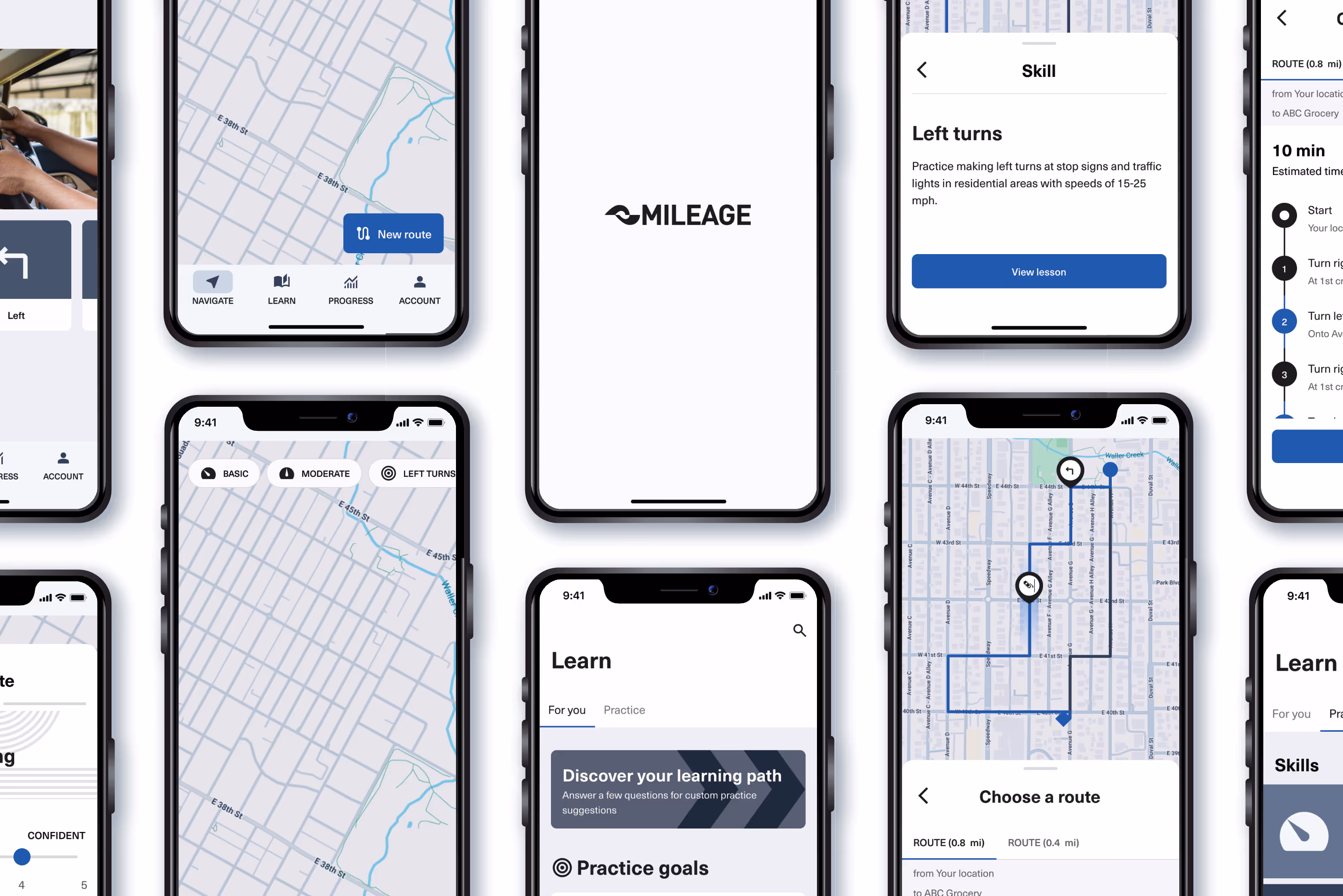
Flows
Each task flow walks the user through an activity in the loop. I chose to start with a practice activity in particular to highlight how the features interact and inform each other.
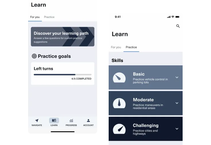
Practice is driven by user goals. Goals pair knowledge from lessons and encourage hands-on practice. Practice is logged to create a sense of progress. Setting new goals helps users to continue practicing.


Branding
For the visual design direction I was inspired by the sense of precision and sophistication conveyed by car commercial brands and simulator games, as well as the clarity of wayfinding design. These are all heavily influenced by Swiss Design, which values a clean composition, geometric shapes, and minimalism.

Challenge: Driving requires a lot of skills!
The complexity of driving loomed over my design process. The app asks users to select specific driving skills in multiple areas. If handled poorly, choosing from a laundry list of skills would lead to bad usability.
Solution 1: Test the menu
To get a sense for the user's mental model for driving skills, I conducted a skill category tree test using Lyssna. The results showed users struggled with some edge cases and could benefit from a structure that indicates an explicit basic to complex menu hierarchy.

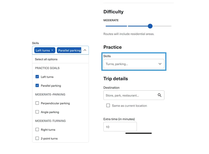
Solution 2: Order of operations
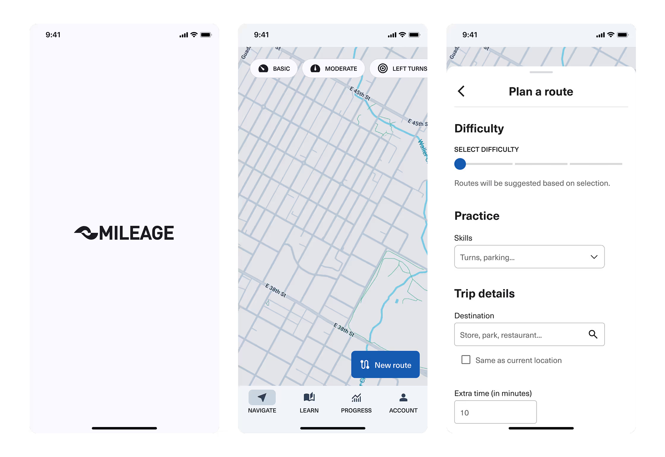
Within the route planning form, the difficulty slider and user goals modify the contents and order of the dropdown menu.
Solution 3: Goals and lessons in one place
During research participants talked about driving situations more than the mechanics. The many skills that make up driving may not be something they think about often. Following the heuristic of recognition rather than recall, learning options needed to be visibly organized in a menu.
I took a step back and revised my sitemap, creating a centralized ‘learn’ tab where users can access skills to set goals and review lessons.
TEST
A conceptual hit!
Strong user consensus during usability
Rethinking skills (again)
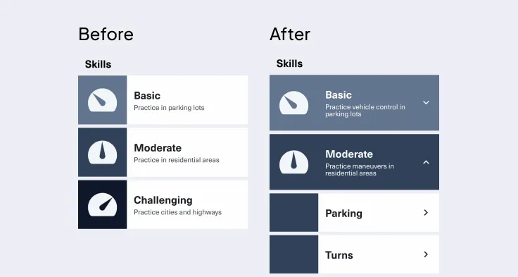
A few participants hinted that visibility was the biggest issue. Basic, moderate, and challenging categories didn’t help them guess where specific content was located. Users also had a tendency to skip over small description text. I needed to give users a quick way to check the contents of each skill section. I decided to use an expand/collapse menu structure to make the details available from the same page.
Route adjustments
During the test, users skipped over the difficulty slider. The default state was set to the lowest difficulty. I changed the default state to prompt users to make a selection.

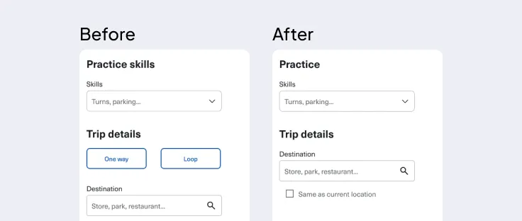
Because the app centers practice, I made setting a specific destination optional. Presenting this as a ‘one way or loop’ choice was highly confusing to users. I changed the field to default to the most familiar option by asking for a destination and presented the loop as a secondary option underneath.
Final design


Conclusion
What I learned
Next steps
I approached this project as a proof-of-concept for an idea I wasn’t seeing in the market. It was fantastic to hear from participants who loved the concept and expressed a wish to see a version of the product offered one day.
If I were to work toward launching this product, my next design priorities would be:
- Design a monetization model.
- Talk to driving instructors. Gather feedback on teaching through an app.
- Incorporate a more robust sense of personalization for users to feel a sense of ownership over their learning and growth as a driver.
Getting unstuck
My process for designing Mileage was my messiest yet. I revised the sitemap 3 times. I was constantly researching. I took a hacksaw to my planned features. I ripped out architecture well into my high fidelity designs.
When I felt stuck, what helped me the most was looking back at my previous artefacts. If something wasn’t working in my polished design, it usually started earlier.
Swiss design is cool, actually!
While delving deeper into the style I found a website called The Swiss Grid which presents an in-depth history based on a museum exhibition. I absolutely fell in love. Check it out if you have time!