
the laughing tail
Aligning marketing strategy with customer needs for a dog training business.
responsive website
Freelance
timeline
60 hours
role
Research,
UX/UI Designer
category
Web design,
small business

introduction
Clarifying identity and values
Who is The Laughing Tail?
The Laughing Tail provides at-home private dog training lessons. As a former client, I was eager to work with the owner on redesigning her website. She’s an amazing teacher, a great communicator, and her positivity and observant problem solving helped me through my dog’s anxiety and separation issues.
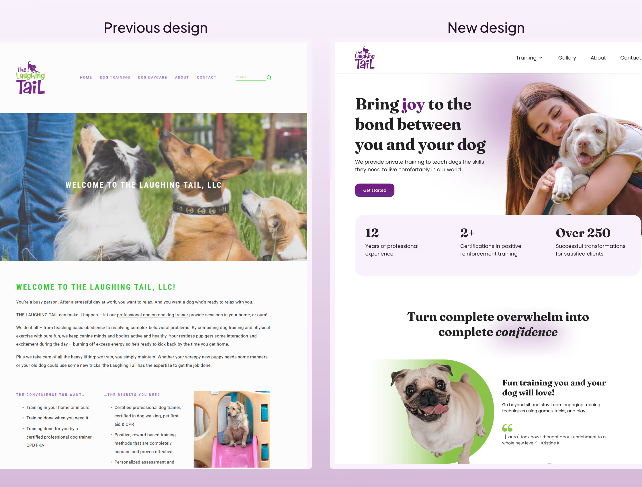
As a business owner though, she wasn’t happy with her current website and I could see why. The value proposition, the style, the voice… it wasn’t her. She had been shifting gradually from dog daycare and board and train to focus exclusively on private lessons. I was hired to communicate her new business model and values, improving reach to a training-minded audience.
No identity, no social proof, and walls of text
Dog owners feel encouraged to contact a service when the business’ online presence supports their trust. According to feedback on the current website, users had trouble confirming initial forms of trust.
- Identity: Users wanted to know more about the trainer and her philosophy.
- Social proof: Users expected to find more testimonials or reviews.
- Communication: Users felt overwhelmed by disorganized sections and walls of text.
Speaking to the emotional needs of potential clients
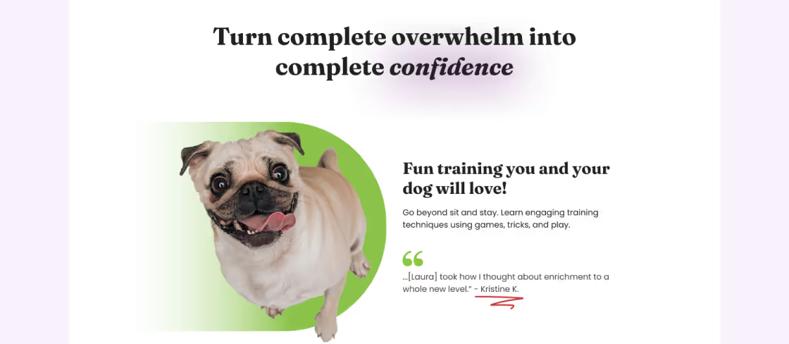
The new website speaks to the emotional needs of potential clients by centering The Laughing Tail’s stellar reputation, extensive experience, science-backed values, and playful visual identity.
research
Who are you and why should I trust you with my dog?
Interviewing dog owners
I interviewed 6 participants who either owned dogs or had experience caring for dogs. I asked about their experiences with the online presence of dog services: how they discover service providers, information they look for before booking, and factors that influence their trust in a provider.
Participants also completed 4 tasks on the Laughing Tail’s current website: 1) Select a training service. 2) Find information about their training methods. 3) Find the trainer’s educational background. 4) Contact the trainer.
Websites support user decisions
I hypothesized that for dog services, users look to the website as a source of information to support their decision but are mostly swayed by other marketing sources like word-of-mouth.
The interviews largely supported my assumption as many users stressed the importance of a business’ reputation. A well-designed website often supported their confidence in a service provider though. Transparency of process, clear writing, and quality photos were all mentioned as crucial for conversion.
Key findings


2 of 6 users felt more comfortable booking a first appointment when a service had transparent policies.

All about trust
The majority of feelings revolved around trust. Dog services depend on their website to establish initial trust: social proof, values, identity, professional appearance and setting expectations.
DEFINE
Helping dog owners make a confident choice
The same ingredients, different proportions
The recipe for establishing trust often consisted of the same ingredients, but the ideal proportions for each ingredient varied for users depending on personality, motivations, and values.
User interview participants had complex thoughts during the usability test when it came to making decisions for their dog. I used personas and empathy maps to highlight and explore the emotions that came up for users.


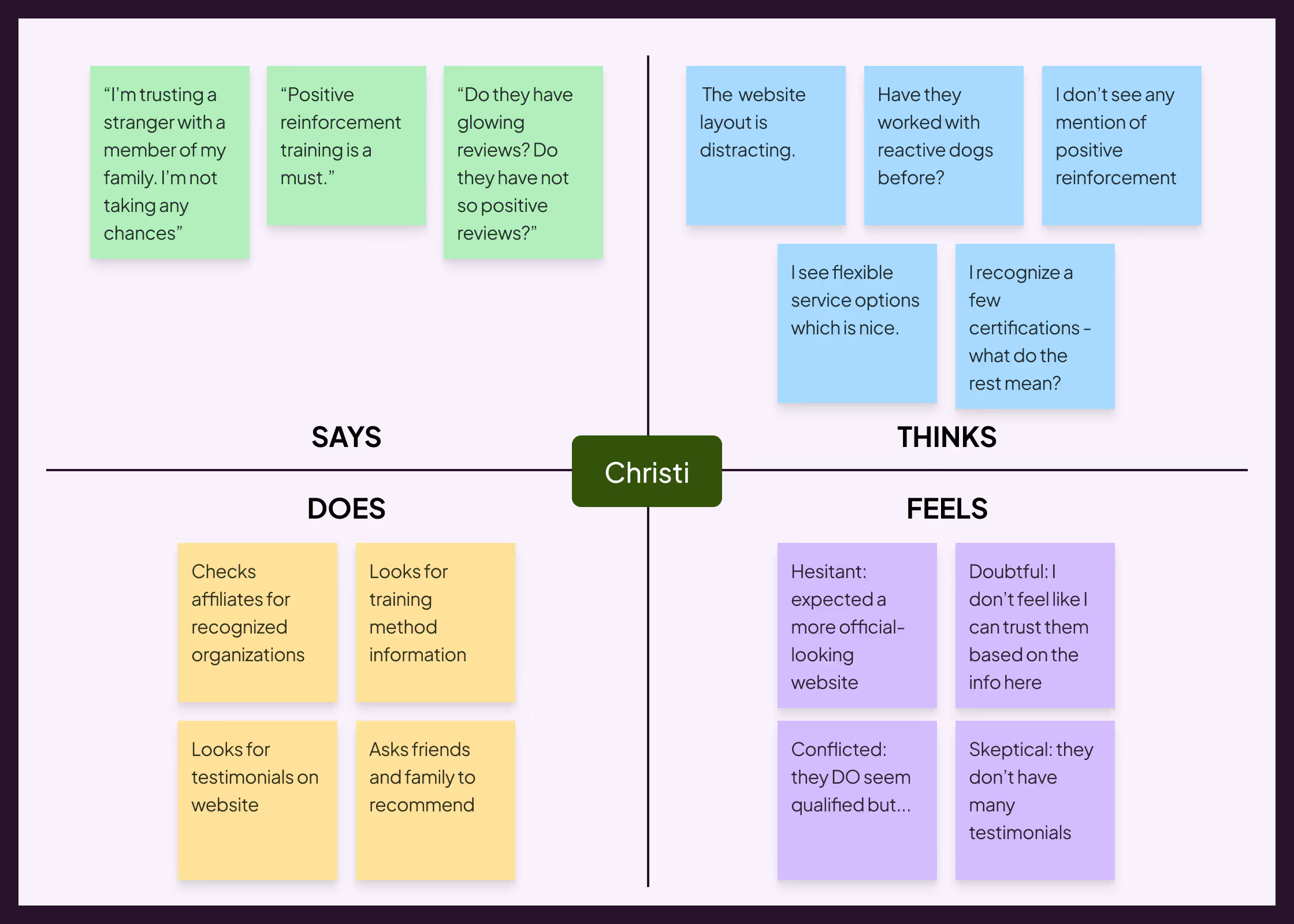
Accomodating for differences
Max’s and Christi’s needs may conflict in terms of personality and values.
“Fun” presentation vs. “professional” presentation - Too much emphasis on fun might feel amateur-ish to someone like Christi. Whereas leaning into professionalism too much could feel stiff and impersonal to someone like Max.
Level of experience - Christi, who is familiar with dog training, might need reassurance of a trainer’s methods and philosophy to feel comfortable hiring them. Max might find that information jargon-y and confusing.
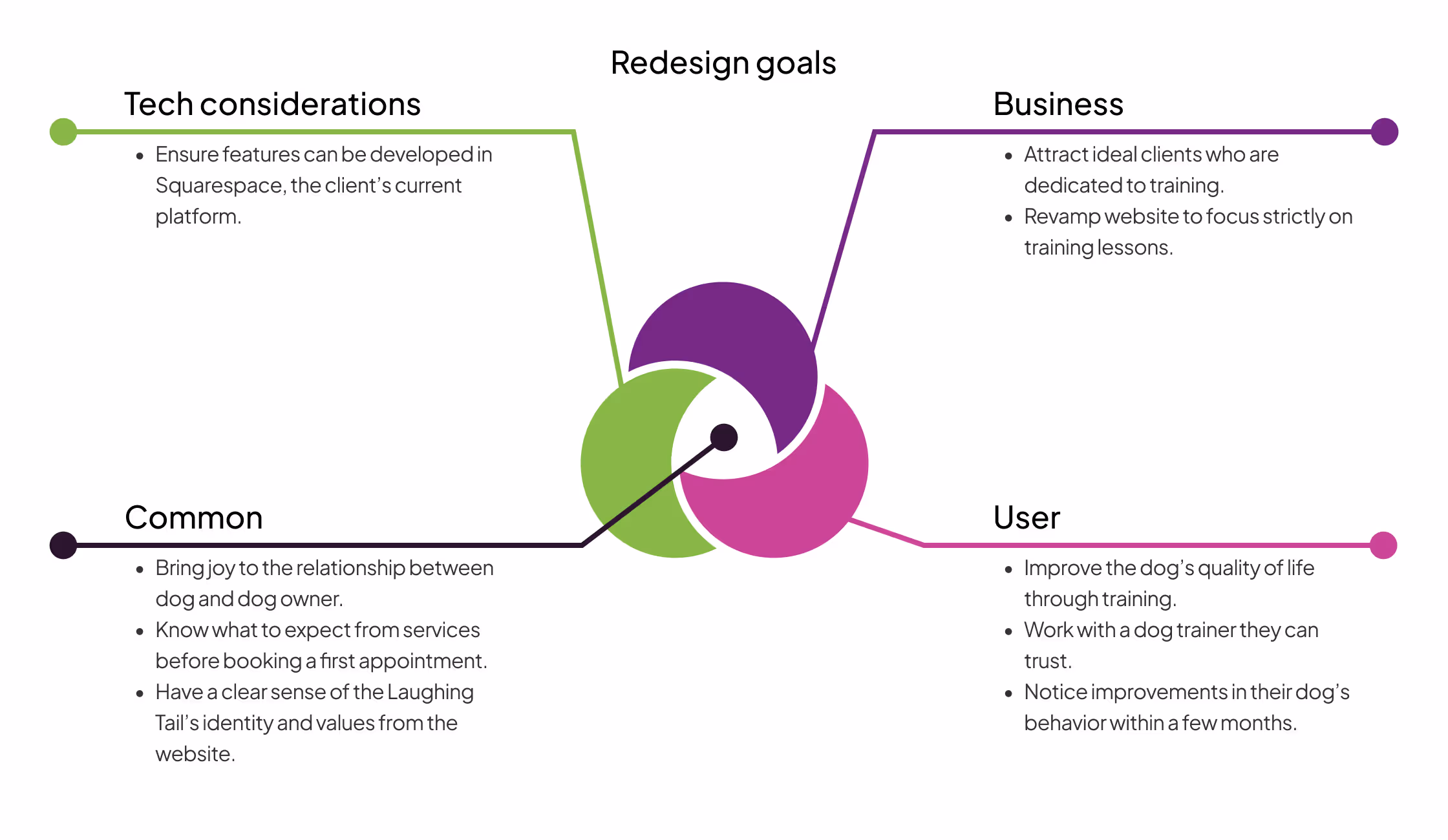
DESIGN
Playful, bold, and accessible
Section hierarchy based on user needs
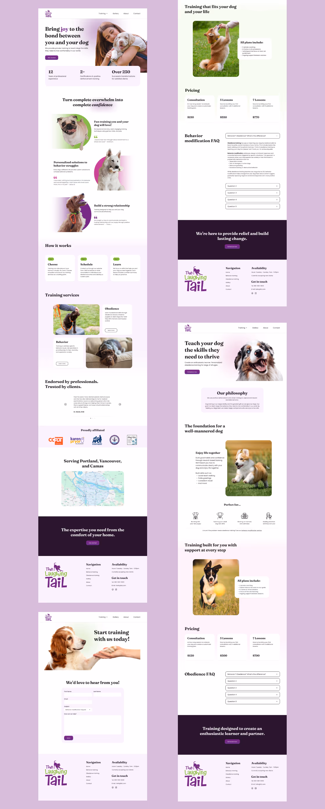
The page navigation of the original website tested well with users, but a lack of information hierarchy impacted impressions of the website. I created a sitemap to explore and define the page sections, positioning information users brought up as important during interviews closer to the top of the page.

A/B testing first impressions
I gathered early design feedback by A/B testing the mid fidelity designs for the hero and benefits sections of the website as these designs are toward the top of the page and largely responsible for making a positive first impression. Hero A and Benefits A were preferred by 4/4 and 3/4 users respectively.

Branding
The client was happy with their original logo. I wanted to match the aesthetics of the logo and do more to push the playful tone. I paired the modern quirkiness of Fraunces for headers with the approachable geometric style of Poppins for paragraphs. I made an alternative logo presentation to help with accessibility at smaller sizes.

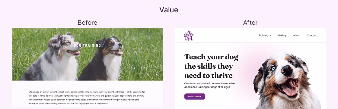
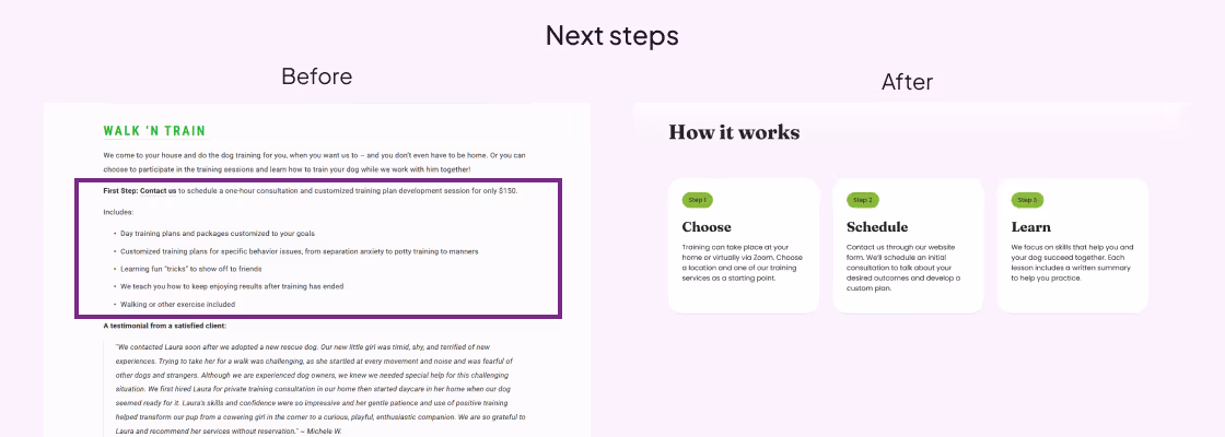
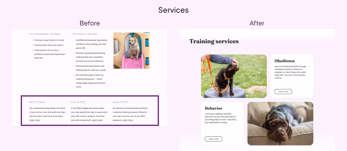
Tearing down walls of text
Important information about the business was part of the previous design but it was frequently buried in dense paragraphs. I prioritized highlighting information that would support trust for both Max and Christi: social proof, clear communication, and transparency.

test
Overcoming knowledge barriers
Tasks felt easier to complete
The usability tasks were chosen to directly compare the new design to the previous website.
While task completion times were similar, participants rated the ease of completing 3 tasks higher for the new design. On a scale of 1 to 5 (1 = difficult, 5 = easy), the new design was easier to use while finding service information, checking trainer credentials, and contacting the trainer.
Clean, professional, and slightly confusing
Participants were positive toward the design but knowledge barriers prevented them from completing certain tasks.


Addressing knowledge gaps
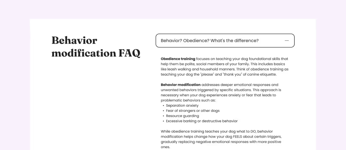
I wanted to retain different service options because they represented the distinct user needs of Max and Christi. The terms ‘obedience’ and ‘behavior modification’ are also an industry standard. I decided to create an FAQ within each page giving an in-depth explanation of the difference.
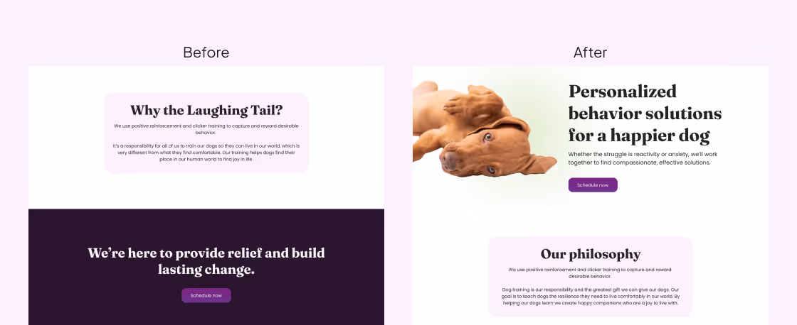
Positioning training methods as values
I solved for unfamiliarity with training methods by framing methods as a philosophy or value-based idea. Most people intuitively understand business values. I also emphasized their importance by adjusting the position from the bottom of the page near the call-to-action toward the top of the page.
Reinforcing trust
I got a few comments during usability about quotes within the benefits section lacking a source. I added names to help contextualize the statements.
Conclusion
What I learned
Client satisfaction
My client was incredibly happy with the new design!


Appreciation for marketing
For the content of the website I used Claude to generate an outline and revisited interviews with my client to write copy that was true to her tone and personality. Writing and designing landing pages gave me a deeper appreciation for marketing. Targeting a specific audience and being persuasive and strategic with your content doesn’t contradict the goals of usability, it enhances the experience.